Wednesday, March 23, 2011

3/23: You Can't Missed it

Japan Earthquake Relief Posters

I've been following Japan earthquake and nuclear leak news very closely. Soon after the earthquake, some Japan earthquake relief posters showed up in the Internet. I was amazed by them at first. However, as more and more posters emerged, most of them using the same theme, the red dot on the Japanese national flag and played with it. I got tired of them, no matter how brilliant they are. I've been to several different website for more variety, but there just ain't much.
OK, if you follow this blog post, you will finish reading it with lots of red dots haunting in front of your eyes even after you turn your eyes away from the computer screen. Sorry about that~


How To Build a Stylish Portfolio Web Design Concept


Hi, as our last assignment is to build a portfolio website, I guess this would be very helpful to everyone.
It is a hand on tutorial for how to build a "designer's" portfolio website. It lists every steps out so that we can do couple changes and make it into our own! how easy and pretty!

Here's the final result. Pretty good, right?!

3/23 Response: Round 1 review for 7988 magazines

I want to say I am really impressed by NOSH magazine~

I can't remember detail, but the magazine successfully creates the feeling of young, energetic and casual. The best thing about NOSH is the consistency I saw among the spreads. Difference designers have different styles, and I totally understand it's hard to unify each person's style without lose designer's characters. Especially for department, NOSH is carried on throughout the pages, for the features, you can tell it's by different designers, but, you know, feature is feature, and should be different.

Personally, I prefer the previous cover better. Thought it's a prototype, I consider it as the first issue of a magazine. It's extremely hard to create the first issue cover, since it should be the summary of the magazine's soul, it should stand out but not too far away from the rest. Maybe, find a better cover, because cover is the most important thing and first thing readers will see on the news stand. It decides whether they will buy it. And finding the perfect picture is the hardest thing.

Anyway, really GREAT job, I would buy it if it's cheap or have free snack sample =)

3/23: Critique SJI logo final

1. The globe for diversity, eyes for journalism
2. Square for male, circle for male, font for sports, black and red for diversity
3. SJI in different size for diversity, words in black  and white for minority and gender difference

4. Black and red poker symbol for gender, color for minority
5. this is my favorite. Color represents different sports, boxes behind the letters are shaped into tribes represents minority. three words overlapping each other and in triangle shape means mutual support and tolerance
 

Wednesday, March 16, 2011

3/16 Critique: 20 logo

LOGO is the hardest thing to design !!!
Especially for Sports Journalism Institute, since there are too many concepts included in the mission: diversity of gender, diversity of ethics, sports, journalism, college students. I am struggling with what in include and how to balance with those are not included.
If you included too many concepts, the logo will be complicated and hard to understand.
Until the class critique that I realize that we should incorporate the most important ideas in the logo: diversity and try to show other concepts through font or deck. that's the same principle that if you want to hold too many things in your hand you turn out not able to hold anything.


3/16 You Can't Miss It

Minimalist design

We need minimalism no matter in design or life style. It puts forward higher demand for designer to subtract the best among all and present to the viewer in a clean form but with condensed meaning behind.


------
Lack Magazine well illustrate the trend of minimalism

It is a fashion magazine in Hungary. It's sleek, post modern and full of ideas and attitudes.
We can tell the minimalism easily from the title: LACK


It surprised the world with the purse shape of the magazine, which you can use as a female hand bag. That's not the only thing that attracts eyes, when you open the pages you just can't help wowing~

3/16 Response:portfolio review

It's time to stop and retrospect.

I am 7 month old !!! as a designer.

7 months ago, I've never heard of indesign and illustrator, not to mention how to use them. I've never done design, never had any artistic training.

I only had limited amount of design works, most of them are class assignments. But I am happy and will keep working harder.

What I cherish most now is the people around me. Some of them are new designers like me, some had rich experiences. But they are all great designers.

I am surprised to see how much one's portfolio can show of a person's character. It was interesting to see how a designer grew, to see how one's design matches his/her personality. Everyone is talented in different design areas. Some did amazing posters, some give lives to photos, some people's designs are always decent, some people design for their loved ones.

Every portfolio made me admire that person more and gave me one more reason to be grateful to have so many great designers and instructors around!

Wednesday, March 9, 2011

3/9 You Can't Miss This

Yes, since last you can't miss this I posted some advertising design, I started to get obsessed with them. 


A good ad design should be a good layout design + a creative idea + match the mission of the product (know your target audience)+ (and often) a good illustration. Ad designs are often bolder than magazine design, they are good at exploring and surprise you! It suddenly occurred to me during designing for SJI logo: a logo design is a thumbnail of ad design! Often when I am reading magazines, I am attracted by the advertising...
That's why when I am browsing for design inspiration, often I am attractive to ad design websites. (It's not betrayal!) 


------------------


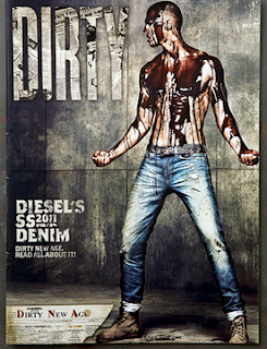
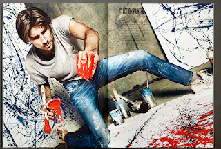
I ran into this 2011 Diesel Denim's Dirty Job advertising poster, which reminded me of couple weeks' ago, VOX's dirty job issue.


VOX's story is really about dirty jobs, but Diesel obviously not, but it incorporated the idea into a fashion studio shoot. They did look really dirty! Not only they looked dirty, some looked like horror movie posters.

3/9 Critique: second draft of professor dress feature

Due to a sudden change in VOX feature plan, I will have to add one more page to my originally two-page feature.
That was a real headache to me. At first I had so much trouble because of too much text. Now when I finally solve the problem I will need to add one more page!
That's why when I gave Erica my third draft (the first draft of 3 pages), she thought it was "incomplete".

So, here's the final draft of the feature.


However, the editor of the story wanted me to redesign the cover, because she thought the professors looked like dwarfs. I thought it was quite obvious that the feet and body did not belong to the same person. and what I want to present is their dressing style in PORTION rather than WHOLE body. I did some minor changes and tried to talked to the editor until she finally thought it was ok.
Anyway, I would like to thank everyone for giving me critiques. They did make my design a lot better!

3/9 Response: Ipad Conference

On Monday, I attended the Ipad conference held in Journalism School.

It is a surprise to me that both WIRE/ADOBE and MAG+ came to the same solution for the magazine on ipad platform.  What amazed me most is WIRE's future vision of magazines on Ipad. Even before tablets got into market, they already started thinking about future.

Yes, future vision is the word I learnt from the ipad conference.

But, the conference also led me to my other concern. For magazines, contents are greatly limited by the platforms. Is it possible for magazine people to have their own platform that magazines are able to lead its own way.

And by the way, I really want to know what future products Apple is planning now, probably they will again change magazine industry several decades later.

Wednesday, March 2, 2011

3/2 Response: POI

I went to one portrait session of POI two weeks ago and I will brush up my memory and response to that in terms of what I've learnt.

It was in a dark room. Three judges sat in the front with a button device in hands. "OUT" "OUT" "IN". They were doing the first round of selection. Photos flashed through the screen one by one, the time they had the chance to stay on screen? maybe 3 seconds. There were more than 1600 portraits photos took part in the competition. Till the second round only 98 got selected.

I was doing my "in" and "out" in my heart and unsurprisingly, I said three times as much "IN" as judges did. In the second round, judges started reading captions, some were even in foreign language. In the final round, 6 were chosen.

There was one judge said something about most of the pictures: yes, they are good, but I've seen too many of them. I only looked at 1600 photos, and I already get bored of same technologies and perspectives.

Lots of them were played on marginalized people. There was one picture impressed me a lot at first. It was a cuban underclass worker, soaked in the trash dump fluid. He looked at all of us from under. 

We all really liked the photo until one judged said that he felt like the worker was demanded by the photographer to get into the dump for the photo, and the photo was manipulated for the effects instead of showing the true working environment of the worker. The photo was kicked out of the selection right away.

I suddenly remember something I read online about groups of photographers going to the poorest place in China and asked people there to act poor and miserable. Especially for disabled people, there were 3-4 photographers following him/her just for some "excellent shots". 

It was so sad. 

3/2 You Can't Miss This

Creative use of typography in advertising

In terms of creativity, advertising is way ahead of us.
I've seem lots of typo design but the purpose for design is merely for visually enjoyment. They are pretty but so what? Design it not showing how well you use software.
why I like advertising typo design much better is because they are content driven. When I look at them just cant help smile or "wow".


OK Some might seem to be too bold for magazine use


-------------------

Since the 10/20 assignment is due next Tue. and I haven't got one. and I do think 20 is very overwhelming for me.
So here's some more inspiration for logo.

100 logos in 100 days
This is a fun project for creativity training, to have one logo every day...(It seems that I will need to do at least 4 everyday to finish the assignment)

Another problem is that Sports Journalism Institution logo would be different from those commercial logos because it should be authoritative. Not to playful but different..There are so many elements in the logo: diversity, sports, journalism, college. It is hard to incorporate so many ideas into one logo..

It took the designer an average 30 minutes for the logo...OMG, he's a genius!